Gillian Rose " Good Eye" Methodology
The main aim of the given essay is to make the analysis of 6 photographs: first three images are from “Ireland in Focus” exhibition in the National Museum of Ireland and other three images from “ Moment in Time” exhibition in National Gallery Ireland. The discussion of photographs will be based on the methodology “The Good Eye” presented by Gillian Rose in the fourth chapter of the book “Visual Methodologies: An Introduction to Researching with Visual Materials”. I have chosen 5 black-and-white and 1 color images.
Henri Cartier- Bresson “ Races” (Thurles, June 1952)
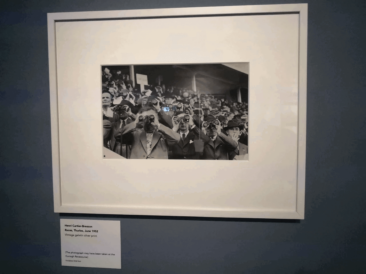
The photograph is made on vintage gelatin silver print. This technique creates a sharp, averagely contrasted composition, all the faces are visible on the image. The photograph demonstrates the fans and their passion for local races. The genre is street photography, and the details as a crowd , binoculars show the reportage side. The black and white shades are more yellow; the general tonal range is more dark than light, the contrast is not so strong. The tones look harmonious. The slope lines on the bottom left and top right corner create the framing effect, therefore, the connection between crowd and the stadium looks well- built. The collars and a tabloid on the background work as slightly jagged fragments of the image. The photograph has a dynamic rhythm. The horizon is located higher than the eyes of a photographer, creating a distanced look and the shallow depth of field. The space looks complicated due to numerous faces on the one point. The perspective generates the effect of presence, like a photographer is also a bystander. Here was used natural light from the sky and no flash as the texture of the faces is smooth. The light is concentrated slightly in the top right side from the middle which makes the sense of depth and vastness of tribune. In general, I have chosen this photo because it is the perfectly formed atmospheric photographs which allows the spectator to see himself as a part of a crowd.
2)Robert Crosswell “Maureen Burke and Patricia Martyn. Dunguaire, Kinvara” ( Kinvara 1955- 1958)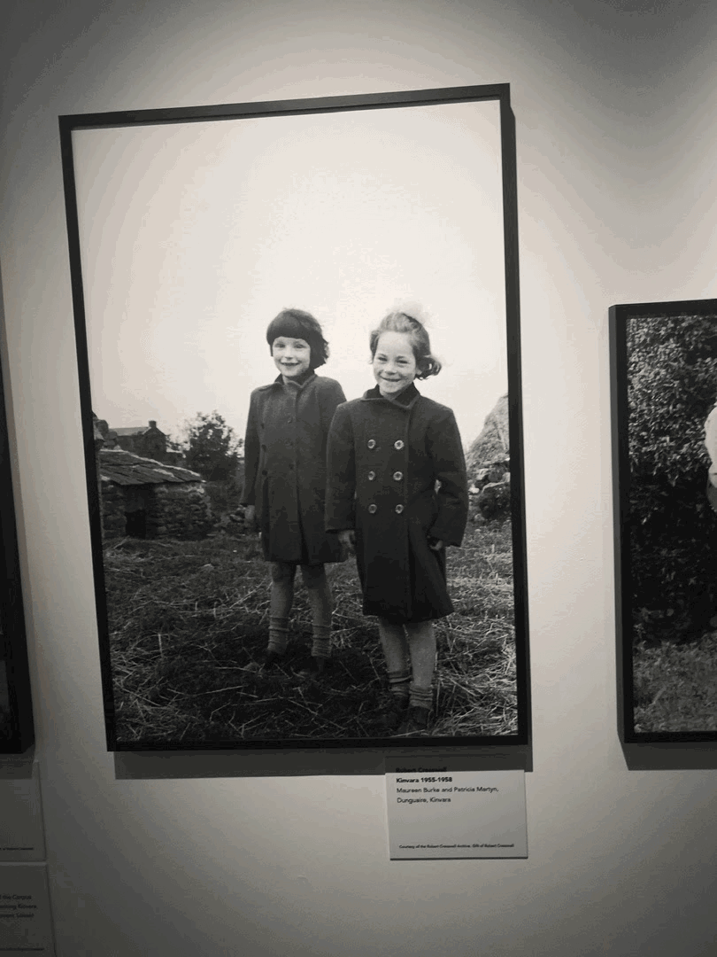
I could guess it was made on vintage gelatin silver print as this photo has the slight contrast between black and white. The vignette let the spectators focus on girls, however, their faces are a bit blurred. This group portrait explores the slice of life in the village with children in it. The hairbow on the right girl makes me speculate that girls were in the church before being photographed. White shades look a bit yellow while black ones look more grey, whites are mostly on the top and blacks are on the bottom of the image. The slight contrast in black and white creates a realistic view, making the composition look relaxed. Girls are close to the camera and they are on the right side of a shot, the grass and buildings frame children from below while the top is open. The houses work as leading lines. The low angle on the photo is chosen for keeping the connection at the same eye level as children. The photograph is static and fragments are fluid- girls on the front are located as two verticals on the photo. The photographer shot the image being a bit on the right side from children to show what is happening behind. The natural cloudy light works as a reflector for girls’ faces- it also highlights their emotions. The huge shadow on the bottom and vignetting effect do a proper portrait framing. This photo has some shadows, nevertheless, it looks airy and could be a part of nostalgia- it is about carelessness. That is why I have chosen this image.
3. Henri Cartier- Bresson “ Seminary” ( Maynooth, October, 1962, printed 1970s- 1980s)
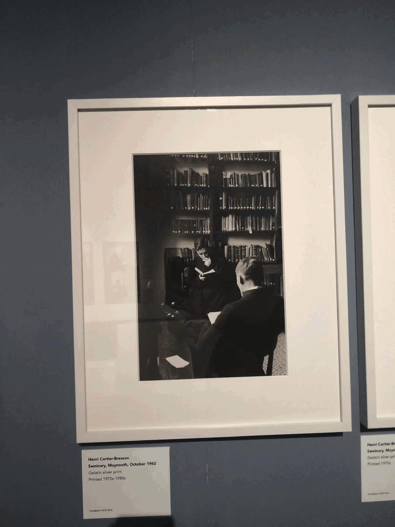
The photograph was made on gelatin silver print with a little cover- up on the left side which makes the spectator pay attention to two reading people. The composition consists of two men from one seminary in the local library. The genre is close to candid photography because it is difficult to call this shot staged. This photo has crispy black tones and muted white tones. The dark tonal range of books and clothes of men make the photo look harmonious. Prevailing black tones create a moody look of the image. The black line on the left side makes the impression that the photographer made the image through the corner of a bookshelf. Books and a shelf work as a frame from the top of a picture while the vertical line forms a split between a man on the background and a man on the foreground. In addition, books take part as the main geometrical perspective. The photograph has a complicated structure with both people and books in focus. The picture is made as much as possible to take a photo on the sly so that is why the eye level is higher,the horizon line is a bit “cuts” the head of a man and it is not straight. The photo is static and concentrated, a bookshelf looks connected to these seminary members. I think men sit next to the window because the light goes through the left side and a young person has smooth shadows on his face. A light accentize the face of a young man and a piece of a book of another man which clarifies who these people are. This photograph is elocative, has a mysterious mood, like these people keep a secret and nobody should reveal it. I like the composition - books in focus, deep shadows and dark left- sided vignette made me review this photograph not once.
4. Andre Kertesz “Chez Mondrian” (Paris, 1926)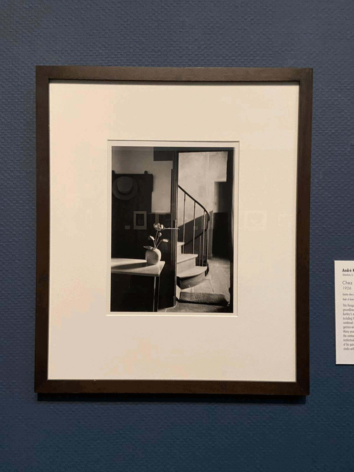
The photograph is printed on gelatin silver print providing the crispy dark tones and a bit muted light tones. The presented still- life work demonstrates the empty flat where the main subjects are a flower and the spiral staircase. The whites look more yellow and the blacks look more brown, however, the heavy contrast remains creating a realistic sunny photo. Despite the statical state, the image has following lines and curves which are connected to each other: a staircase, a slope line on the wall, a table, a vase, a hanger with a hat and a picture on it. The vertical line positioned in the middle of the image creates two different dimensions- the light and dark one. This angle also builds the illusion of isolation. This photograph has not so many details but still looks presumably complicated. The first horizon line located below and the doorway in the corridor creates the depth of the image. The sharp sunlight from the right side of the composition has stressed that the main plot is gathered in the corridor while the part with a room is drowned in darkness. The highlight on the table and the shadow from a vase allows the spectators to think that a flower is an additional main object of a composition. For me this evocative photo gives me the impression of standing here, alone in the room and thinking about loneliness. This fact made me take this photo for scrutiny.
5. Jacques Henri Lartigue “ Grand Prix, de l’A.C.F., Circuit de Dieppe” (1912)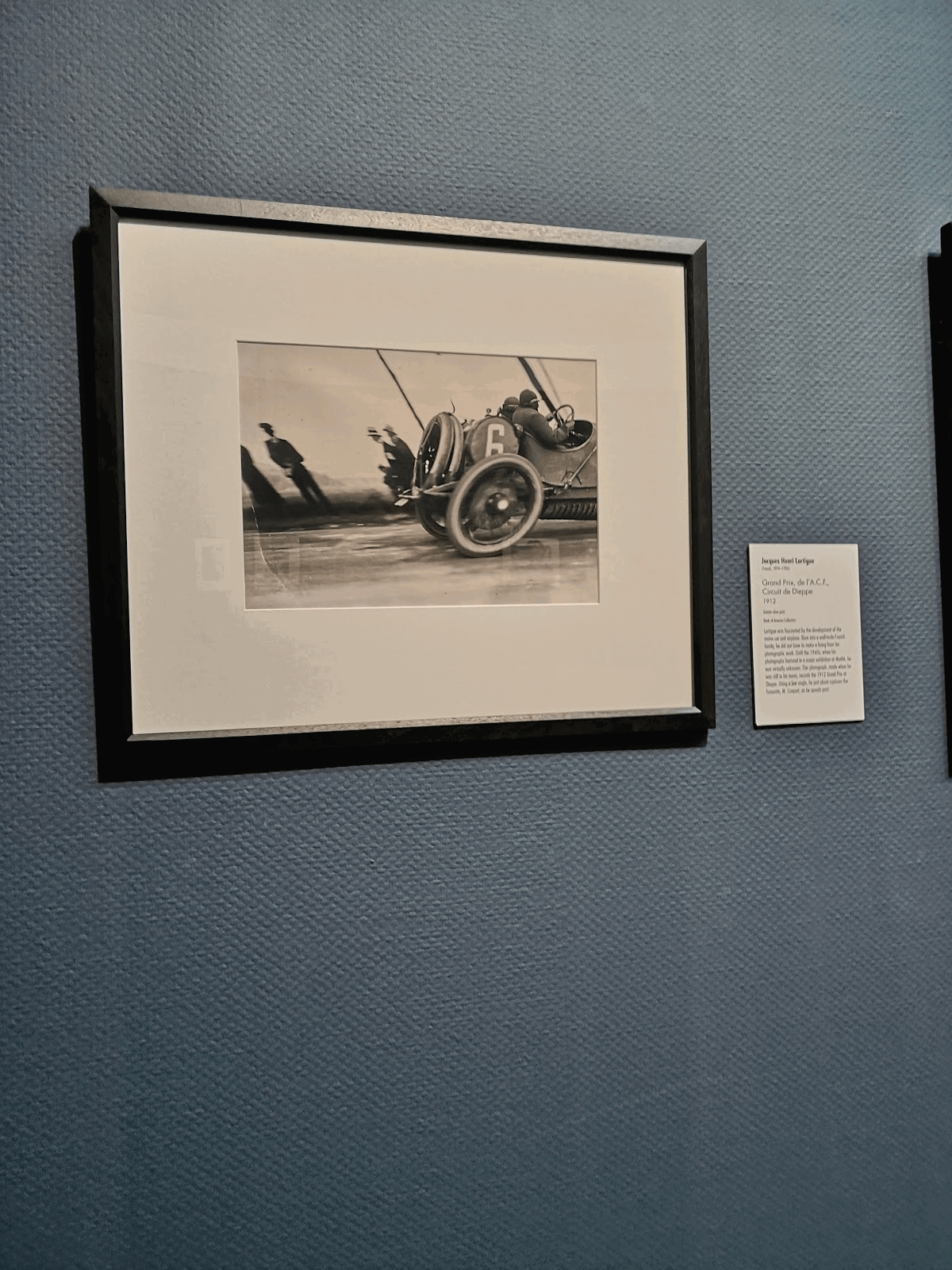
This photograph was made on gelatin print more than once because it is so difficult to capture this dynamic distorted effect which is reflected on people and a road . Nevertheless, the racing driver remains sharp while the road and wheels are smudged. It is the event or reportage photography representing the races competitions. The picture is more white than black, with a hint of yellow. It is possible to see the shapes of the clouds. The contrast here is strong, it has blacks, whites and grays in it. The colors are close to realistic sunny photographs. The perspective here is complicated and dynamic, there are numerous lines and shapes: people, horizon line, a car, ams wheels. The right side is filled with a car while the left corner has only an empty road and people. Two lines above the drivers make spectators see the movement. The photographer positioned the horizon line a bit lower from the middle in order to capture both a car and a road with a sky reflection on it. This eye level also shows that this competition is so far away if you look at mountains on the left corner.The sunlight popping from the clouds gave a “floating road” effect and made a shadow below the car . The front wheel , sky and a road are mostly highlighted on the image- it shapes an interesting composition. This photograph is expressive due to distortion, leading lines and a motion blur. It makes me feel that I am a spectator of races. That is why I have chosen this photo for analysis.
6. Arthur Siegel “ Sportscar” (n.d.)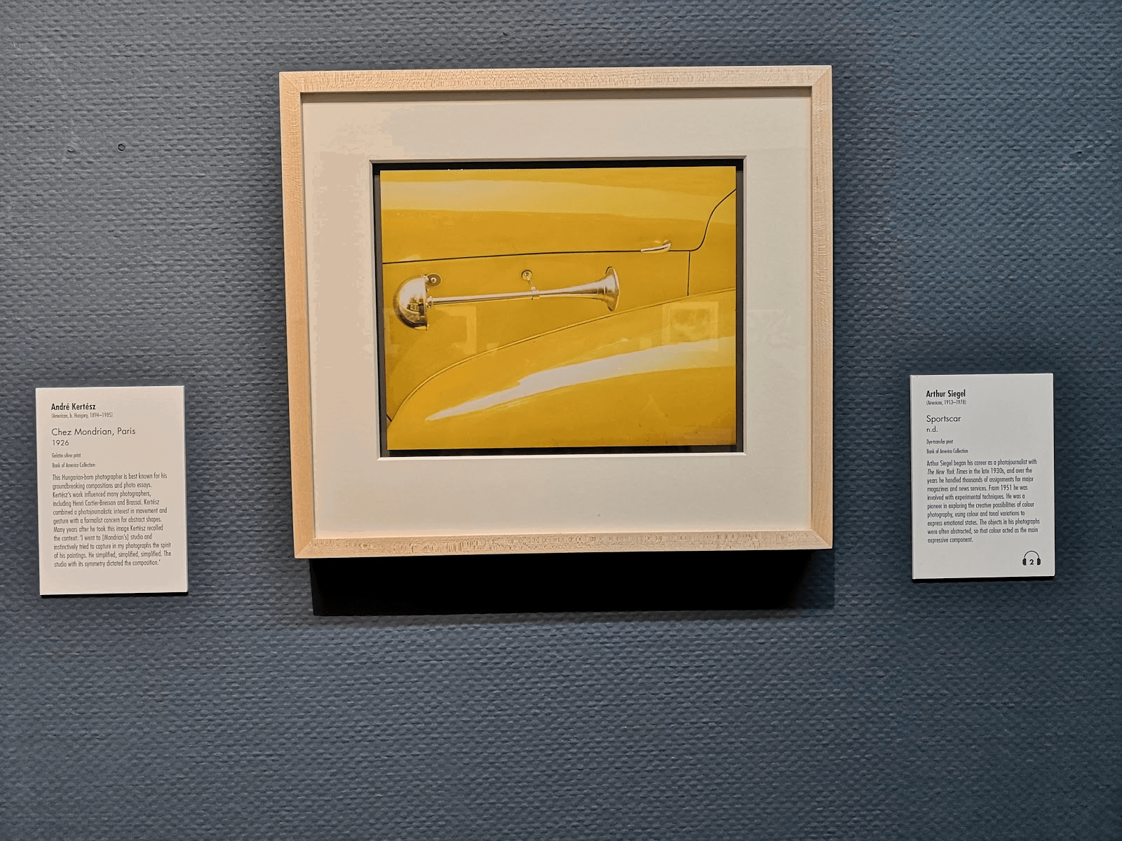
This is the only one color image which caught my attention. I can guess the photo was made with a wide- angle lens because there is no distortion on the car door. The photo is printed on dye- transfer print which helps to show contrasty juicy image. The photo portrays the car door of a vintage car, probably it is a detailed shot for commercial photography. This cyber yellow tone is highly saturated and it has dark shade with some transparent yellow highlights. The colour range is harmonious- it has yellow tones only and some black lines structuring the car. The leading lines are located above and behind a door handle. The vectors in general are the same, a picture looks like a single whole. It is a static and simple composition. The eye level was situated on the same level as a doorknob to make a well- detailed close- up image. A little thing above a doorknob, however, destroys a line above. The photograph was made with a flash and a reflector as the highlights here are smooth and make the subject to be voluminous. If you look carefully, you can see the reflection of a camera in the door handle. Generally I like this shot because it is minimalistic and the color looks funky and makes a vintage vibe.
To conclude, although there are photographs from two different exhibitions , the half of presented ones share the similar genre of candid photography- the mentioned photographers tried to create genuineness in their images . Even if a picture does not have a person, it is available to expose what emotion the photographer wanted to capture. Thanks to the “ Good Eye” methodology , I can analyze the images and understand the purpose the photographer wanted to say.
